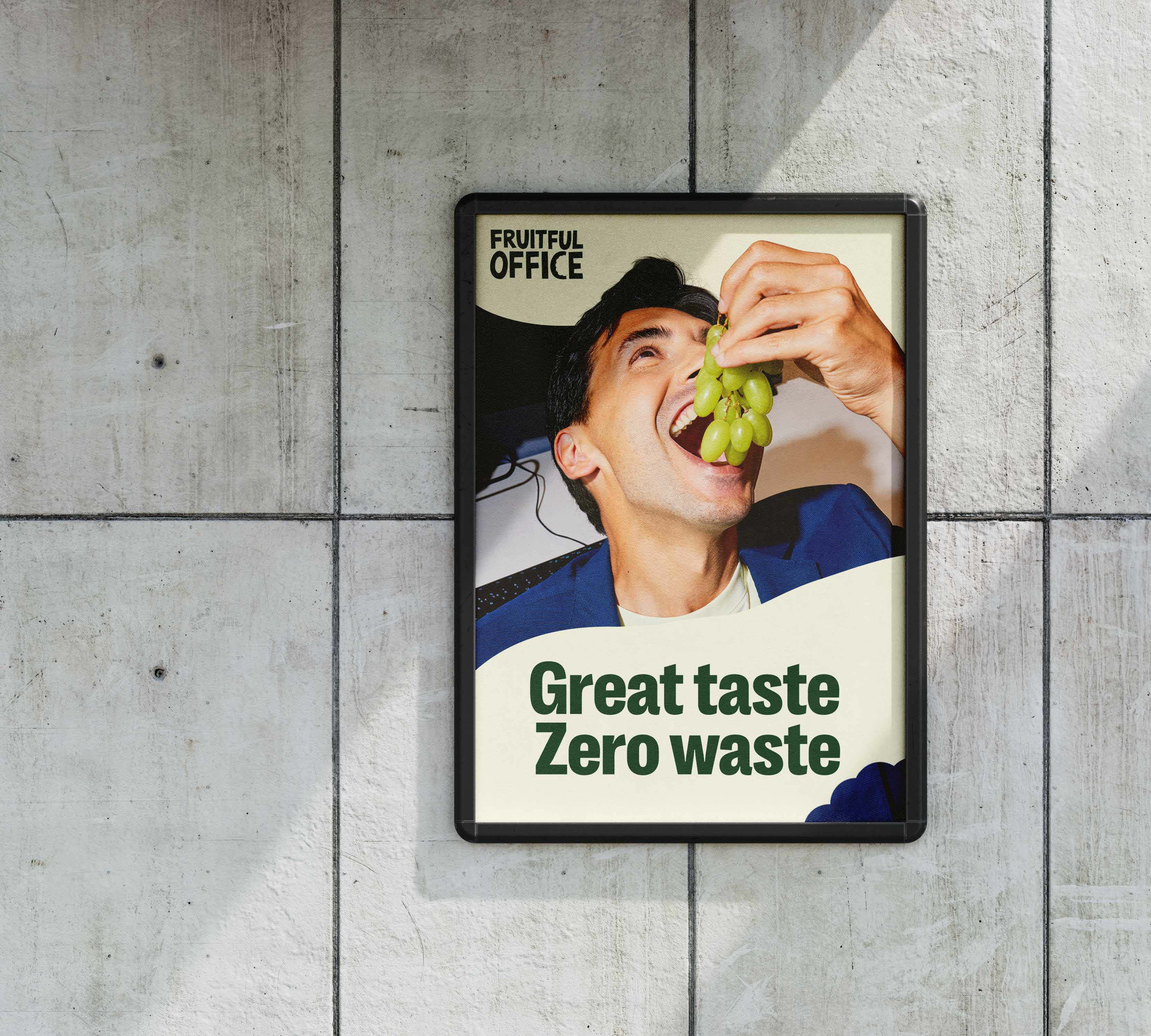
Fruitful Office
Brand refresh for the UK’s largest and original workplace fruit delivery provider — a company that supplies fresh produce to thousands of offices throughout Europe daily.

Fruitful Office wanted to evolve their brand into a more accurate reflection of who they are today: a vibrant, people-first business delivering healthy, sustainable workplace solutions at scale. Their proposition is rooted in wellbeing, accessibility and environmental responsibility.
Fruitful Office had grown significantly since its founding in 2006, expanding into a nationwide service with a strong sustainability mission and social impact. The brand needed a refreshed visual language that could carry this story consistently across touch points, markets and internal teams.
Working alongside Studio Schwung, we created a flexible visual system built around a bespoke logotype, crafted to feel friendly, modern and full of character. A distinctive bite-mark asset adds personality and immediacy, while a refreshed colour palette and considered typography bring clarity, warmth and consistency across all communications.
The result is a cohesive identity that enables Fruitful Office to better communicate its core values; health, sustainability and care for people and the planet with confidence and clarity.
Logo design
Brand identity
Packaging
Design templates
Social media